Capabilities Deck
The Chopping Block, Inc.
This presentation is an HTML page.
Press → key to advance.
Toggle notes with the 2 key.
Zoom in/out: Ctrl or Command + +/-
Having issues seeing the presentation? Read the disclaimer
This presentation was printed from an HTML page.
A fully interactive version of these slides containing examples and links to further resources can be found at:
http://choppingblock.com/presentations.
This page is based on the HTML5 Slideshow by Marcin Wichary, Ernest Delgado, Alex Russell and Brad Neuberg:
https://github.com/html5rocks/www.html5rocks.com
Intro
Chopping Block
World Domination Through Graphic Design
Since 1996
Intro
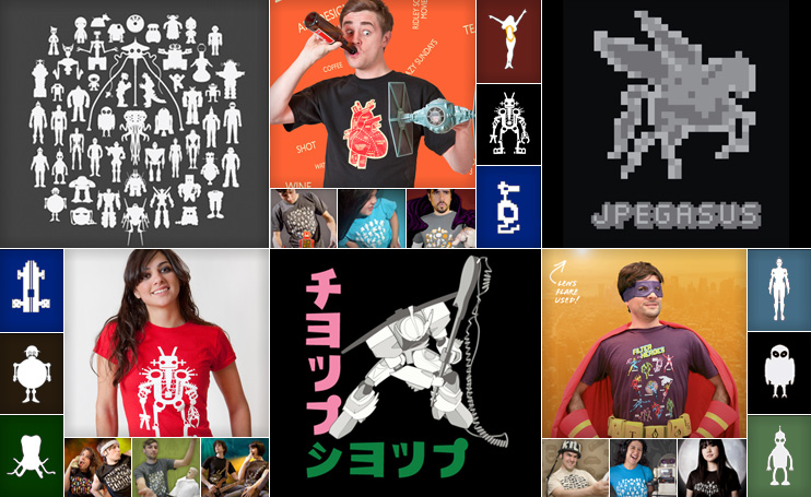
Chop Shop
Shirts For Designers, And Nerdy Designers
Since 2004
Notes:
- With Shirts Like This, Who Needs Pants.
Intro
Teaching
NYC @ School of Visual Arts
Since 1998
Take exceptionally talented creative professionals.
- Teach them how to work digitally.
- Teach them how to build for & communicate online.
We are big fans of process & efficiency...
Design
Solutions
The Chopping Block Way
Power
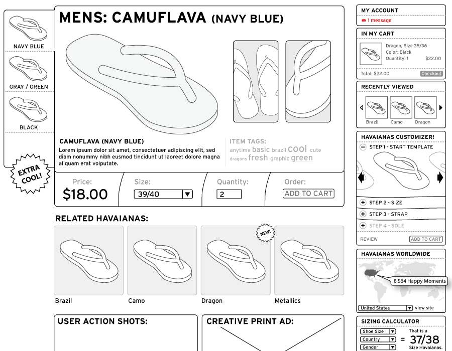
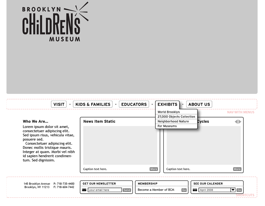
Structure (Wireframes)
- Separate the function & content from the design.
- Wireframes are a BIG part of the creative process.
Functionality
- Build a prototype. Talk about it.
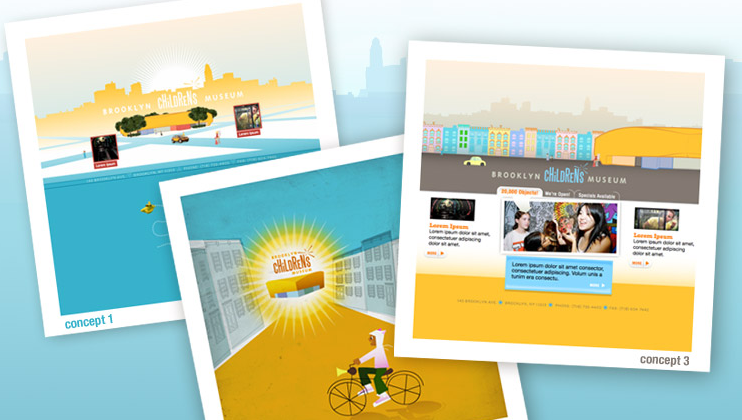
Look & Feel (Concept Boards)
- Allow the design (and the designer) to run free.
- Reduce the complexity & capture a feeling.
Bring everything together
- Play on the strengths of the medium itself.
Notes:
- Essentially, we divide and conquer.
- There is nothing worse than a client not looking at the design because they are caught up on the functionality or content.
- If your information architecture team is not creative, you are most likely not going to have a creative product.
- If your information architecture team does not understand how to build what they are drawing, you are going to have a problem building what they drew.
Design
Structure
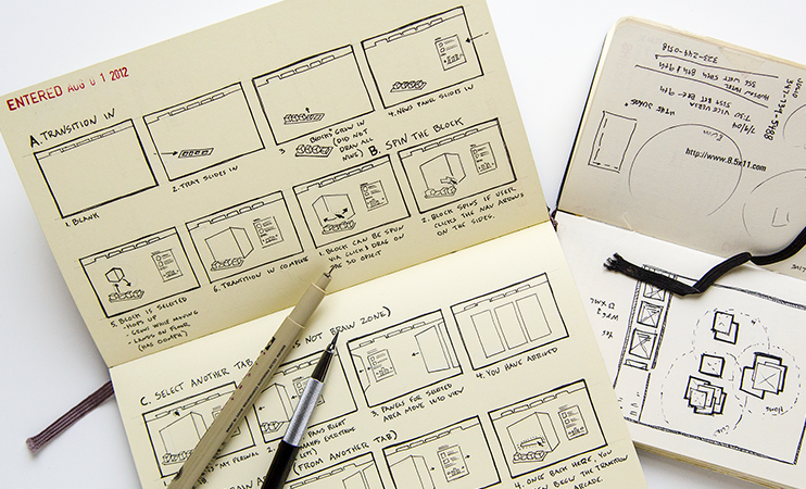
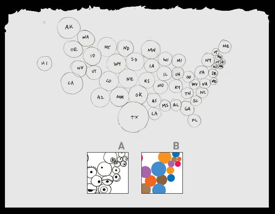
This Is Not A Wireframe
Yup
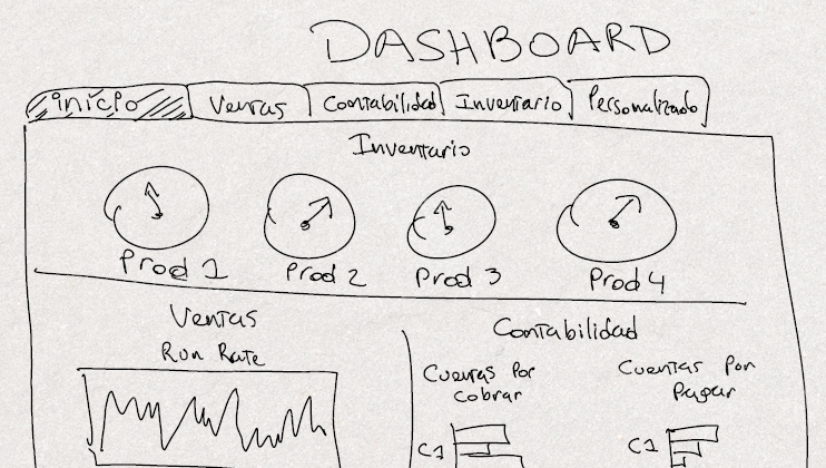
- That's a sketch (an idea), you can work from here.
Notes:
- Sketches are handy, they are the single most effective way to convey an idea. We share them with clients all the time. Once some ideas take hold, we incorporate them into our wireframes.
Design
Structure
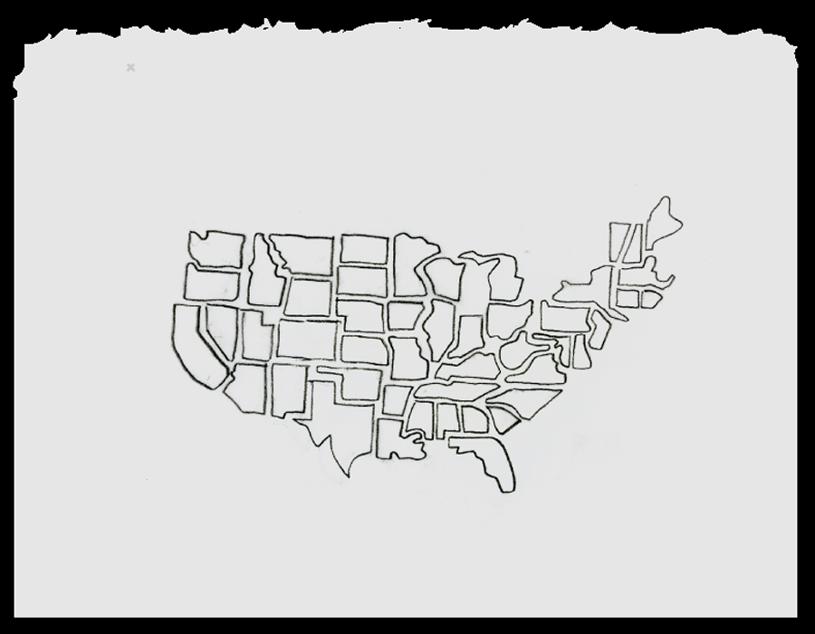
Neither Is This
More Yup
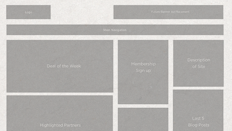
- Still an idea, you can not commit to this.
Design
Structure
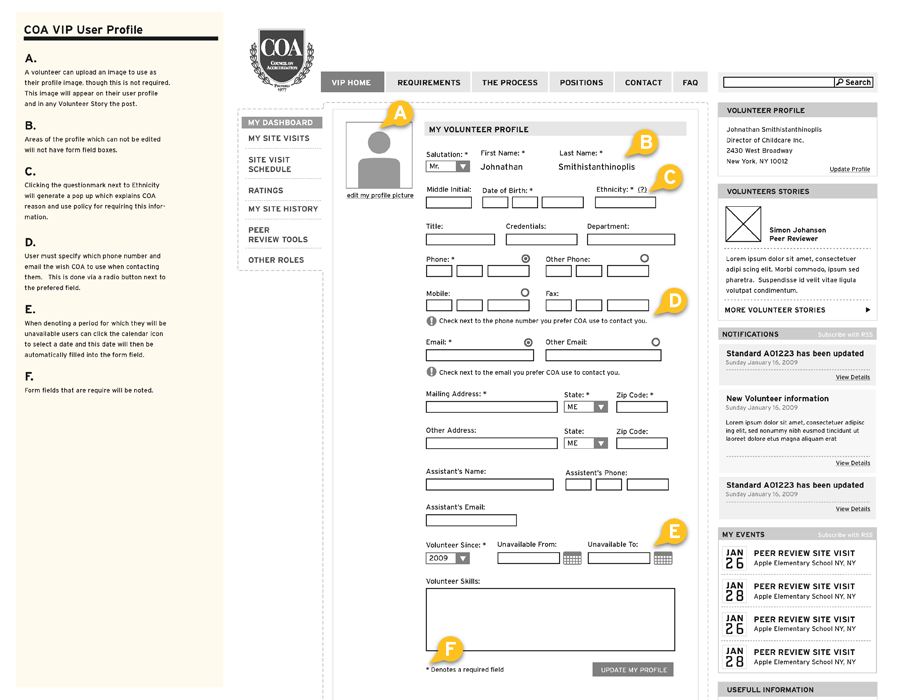
The Functional Spec
Kinda Yup
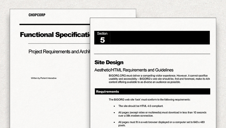
- Also helpful, but not by itself.
Design
Wireframes
Create & Iterate Where It Is Fast
Flexibility
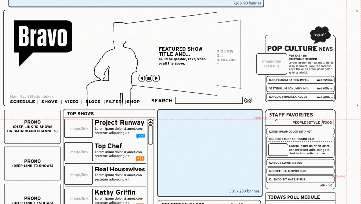
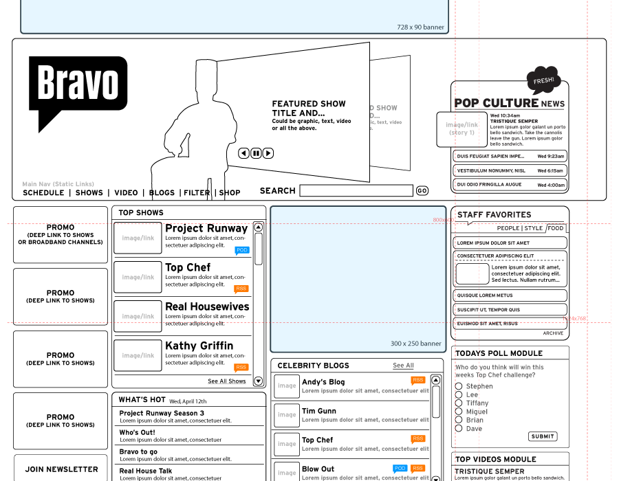
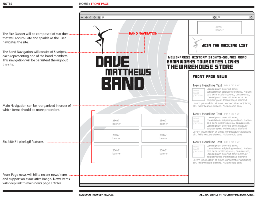
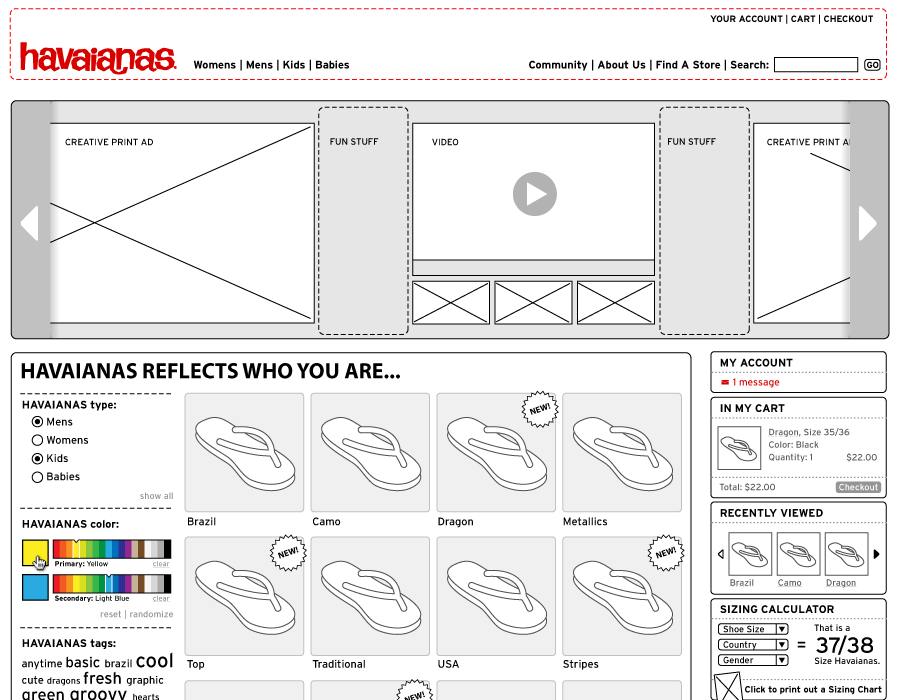
A wireframe is a blueprint, blueprints have standards.
- You can measure it - you can build it.
- Sample copy - word count and content approval.
- Pixel perfect width, ad's, video and Flash embeds.
- Yes, wireframes have grids. - 960.gs
- Adobe Illustrator, save time & design over top of it.
A wireframe can/should establish the functionality.
A wireframe can be creative.
- The freedom to think visually. Sans final design.
A wireframe is a discussion document.
Notes:
- There are many 'wireframe tools' out there, but nothing as powerful as Adobe Illustrator.
- Create an Illustrator file containing re-usable wireframe parts and you can easily best the features within many stand alone wireframe tools.
Design
Look & Feel
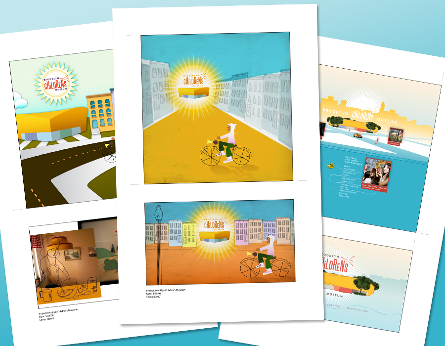
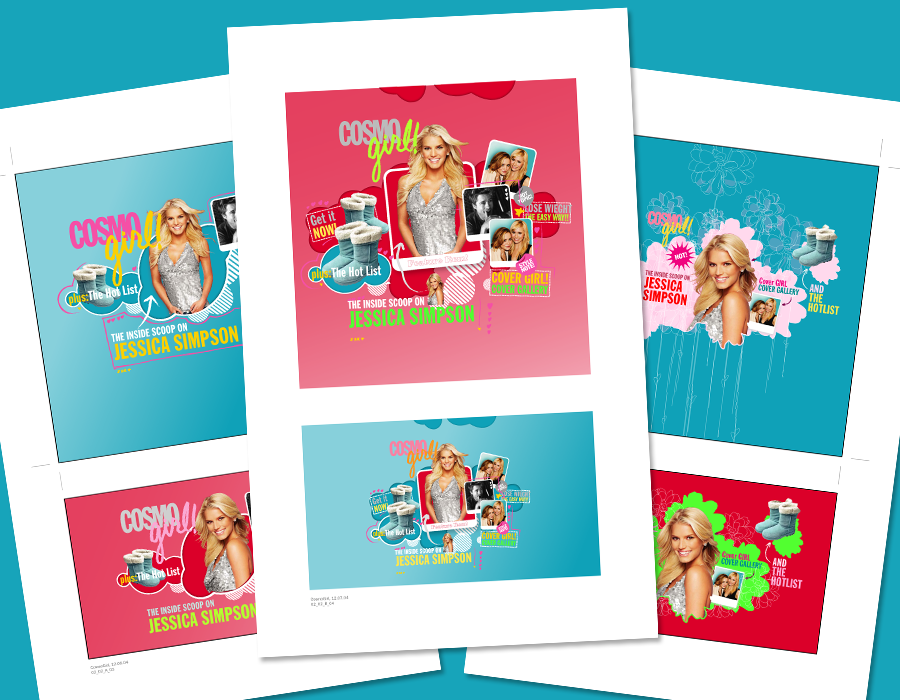
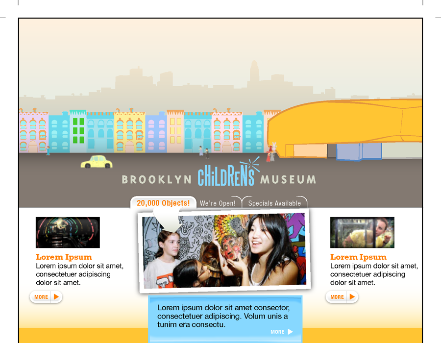
Concept Boards Keep Projects Fresh
Explore
Lessen the content, increase the exploration.
- Pick 4 to 6 relative sample elements.
(navigation, images, sample feature, etc...) - Explore the formal design possibilities.
- Keep multiple versions on each page (as a catalyst).
- Make compositions, present well, react quick.
Wireframes are there to field the content questions.
Concept board design work is scalable.
- Bring in another designer.
Design
Look & Feel
Build Your Own Reference Library
Crank
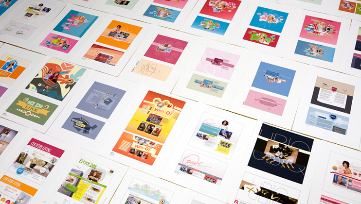
- It's ok to steal your own ideas...
Design
Merge & Build
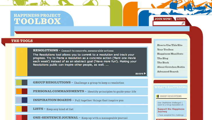
Divide, Conquer, & Skin The Wireframes
Happiness
Design
Merge & Build
The Sum Of All Parts
End Game
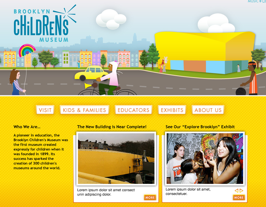
Move forward with project design (with a safety net).
- Merge the approved wireframes with the approved look & feel.
- Tedious at times yes, but you should have a really solid direction and blueprint.
- Keep the wireframes up to date as scope shifts.
Depending on the project, development can start now.
- Once things are approved, sometimes it's faster to build out full design using CSS.
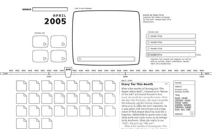
Case Study: Lifebook
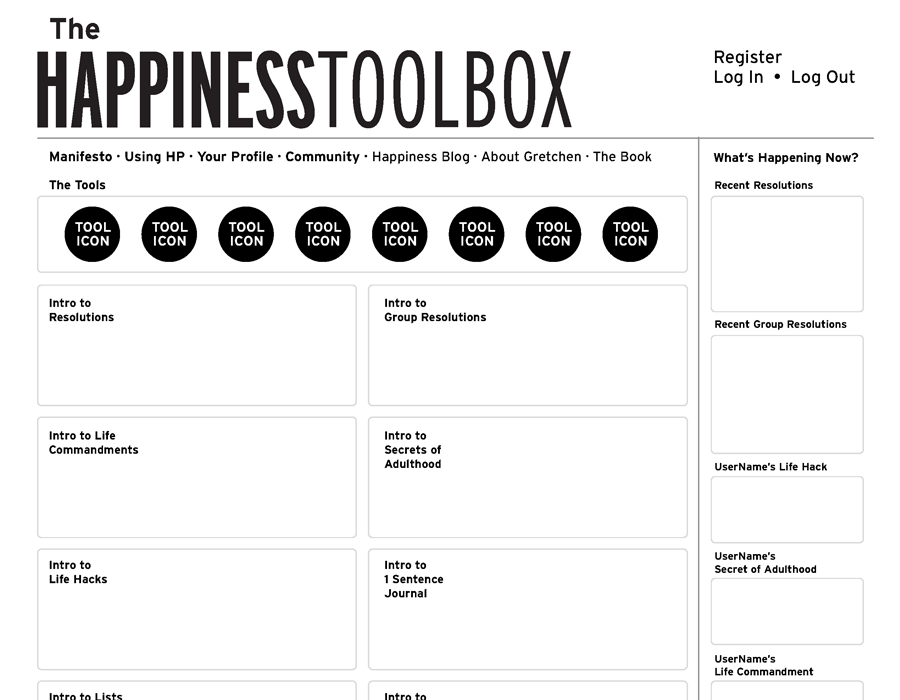
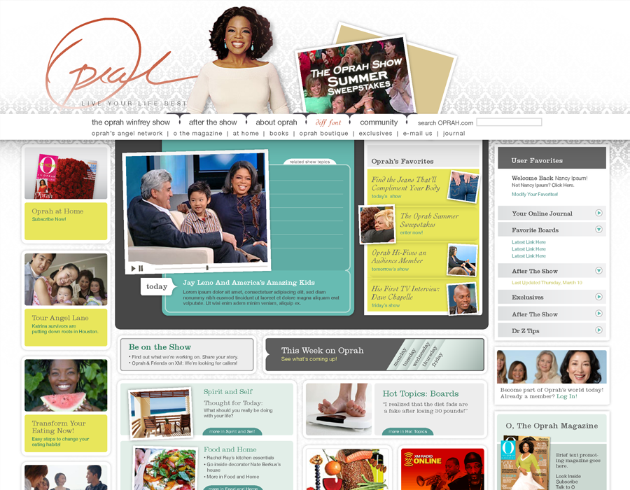
Wireframes
Variations
Notes:
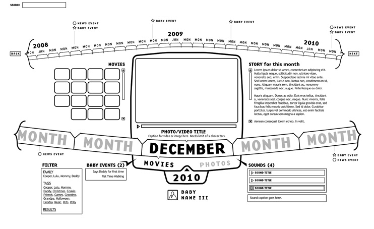
Case Study: Lifebook
Wireframes
Variations
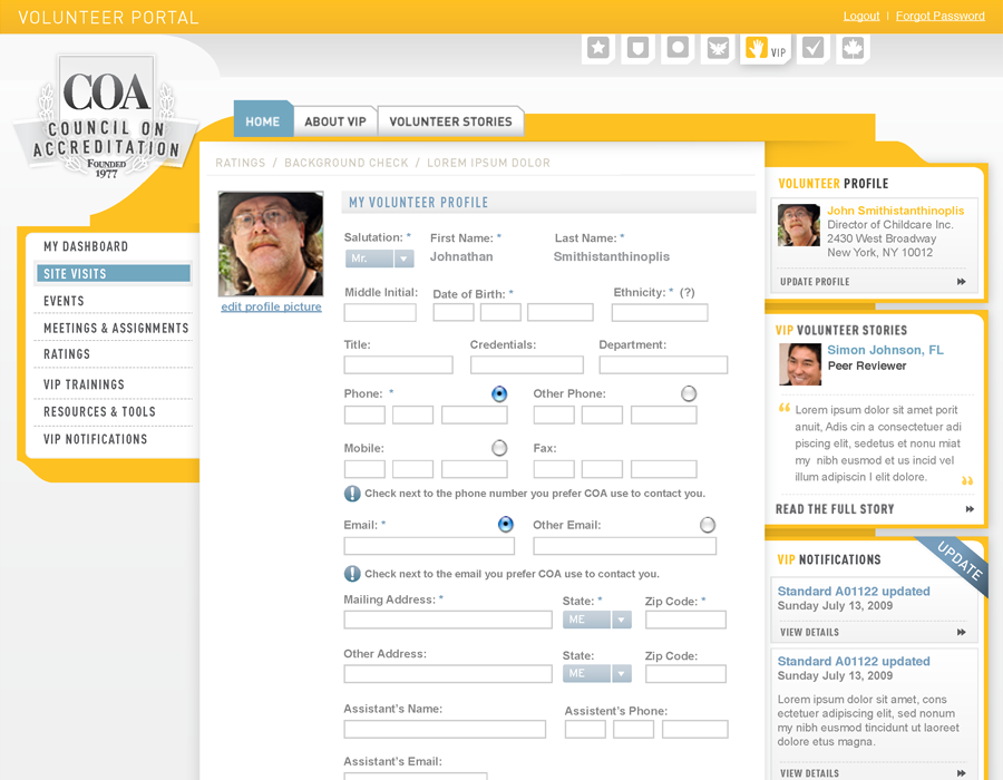
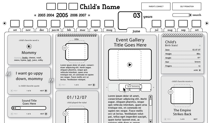
Case Study: Lifebook
Wireframes
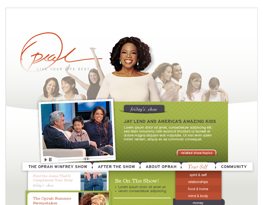
Final
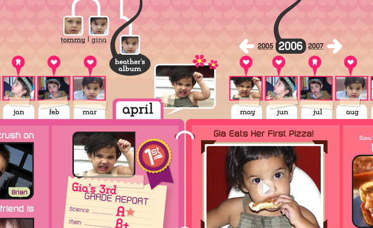
Case Study: Lifebook
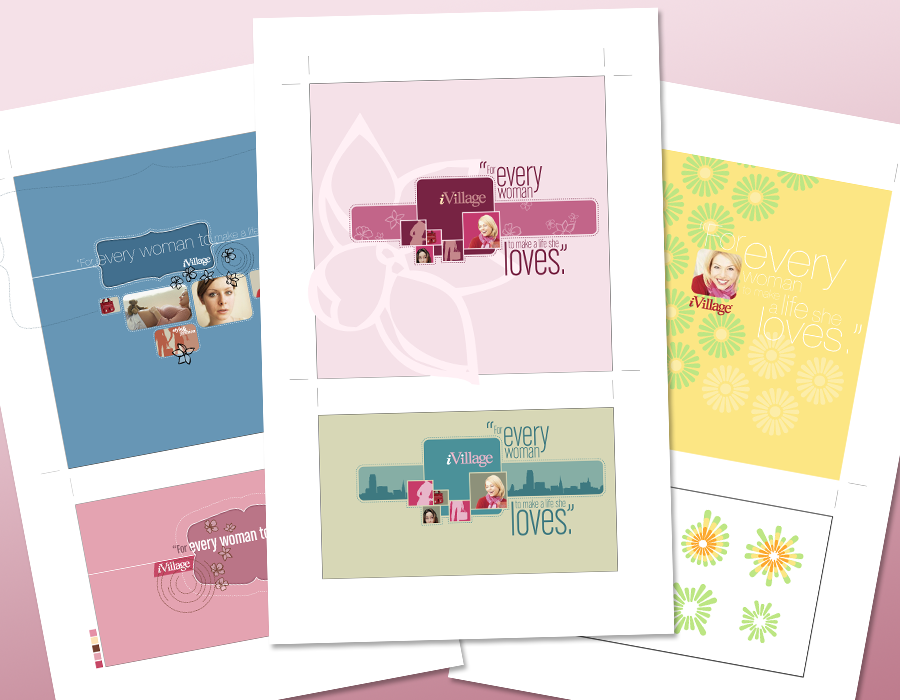
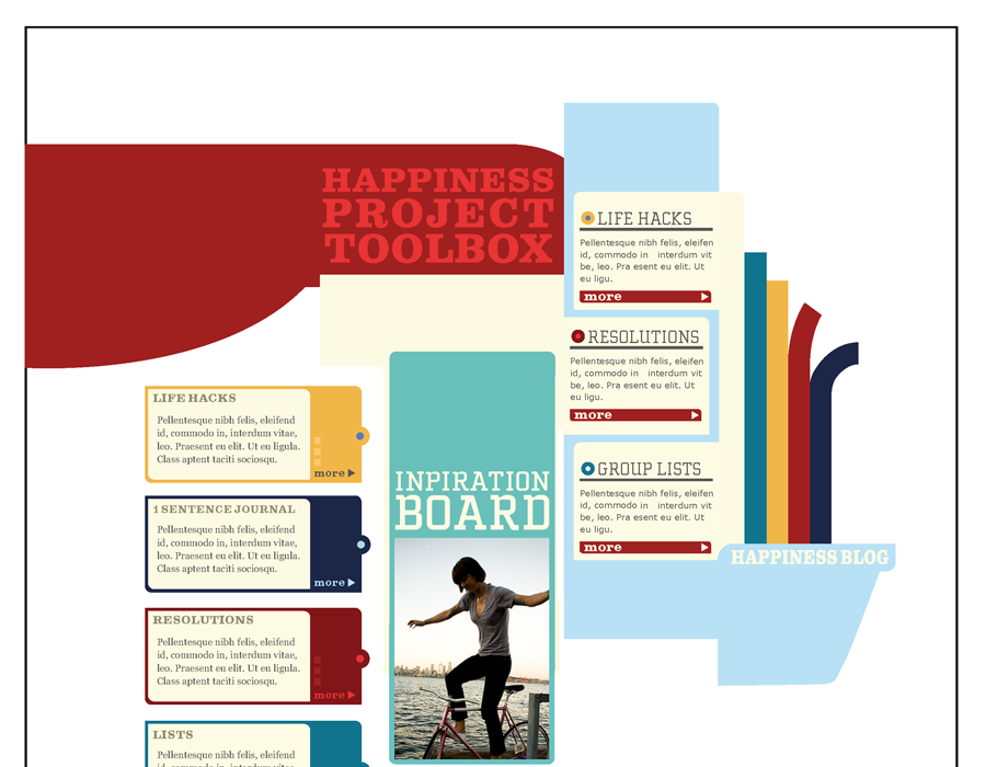
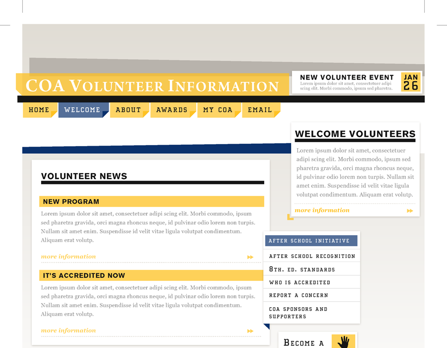
Moodboards
Scrunch
Case Study: Lifebook
Moodboards
Scrunch
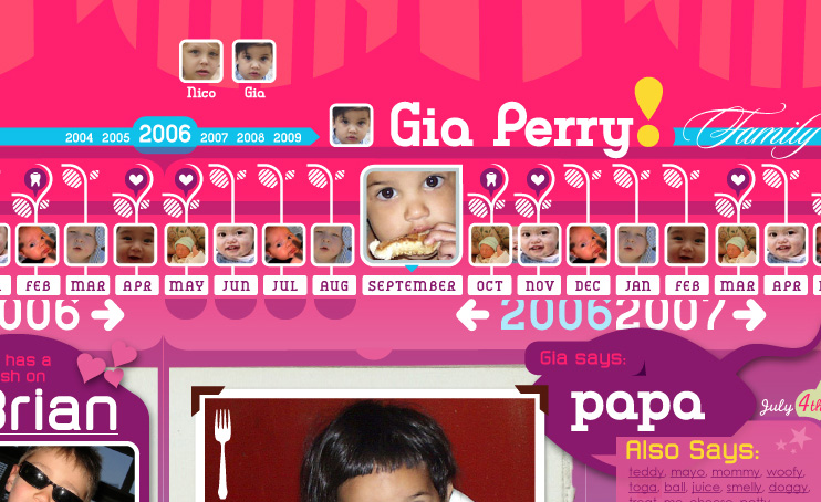
Case Study: Lifebook
Moodboards
Scrunch
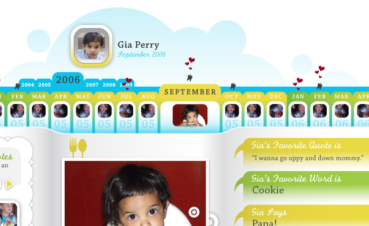
Case Study: Lifebook
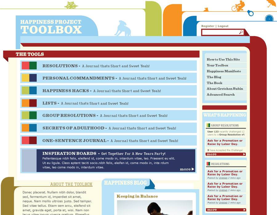
Minor Variations
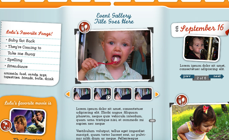
Case Study: Lifebook
Editor Wireframes
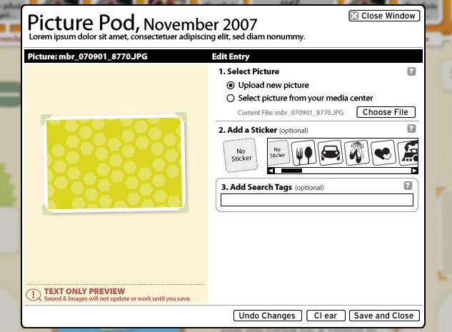
Case Study: Lifebook
Editor Wireframes
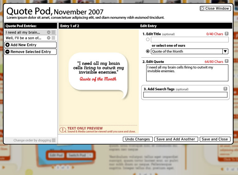
Case Study: Lifebook
Editor Wireframes
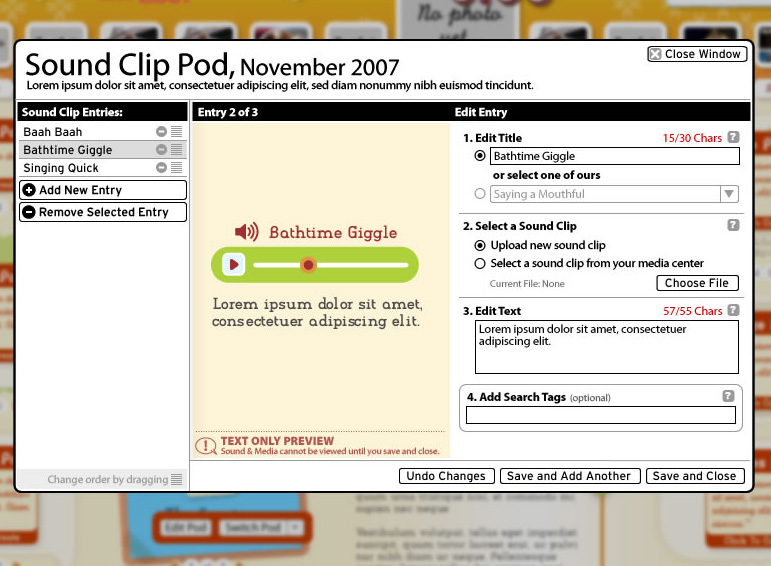
site
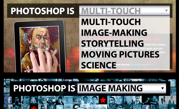
Photoshop dot com
Adobe Systems
Photoshop is the Power to...
- Design, UX, Copywriting, Consulting
exhibition
Elect Next
National Constitution Center
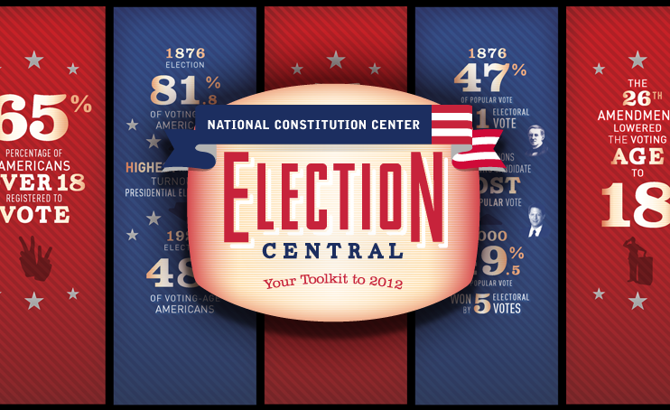
Interactive Museum Exhibit
- Design, UX, Animation, Support
- Touch screen exhibition installation
mixed
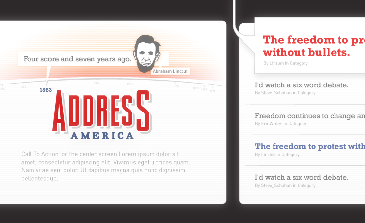
Address America
National Constitution Center
Interactive Museum Exhibit and Website
- Design, UX, Animation, Support
- Touch/tablet exhibition installation
site
Fred Figglehorn
Ad hoc Inc.
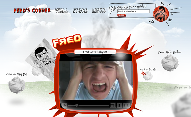
YouTube Series
- Design, UX, Development, Animation
Mobile
HeyZooka
Clickatell Inc.
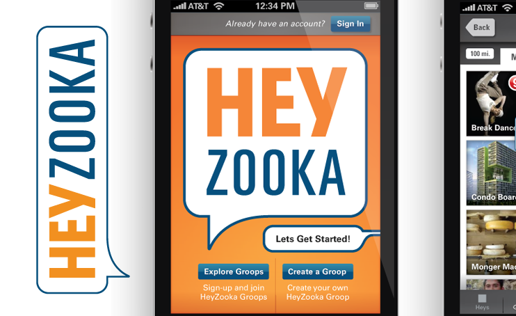
Soon-to-launch mobile app
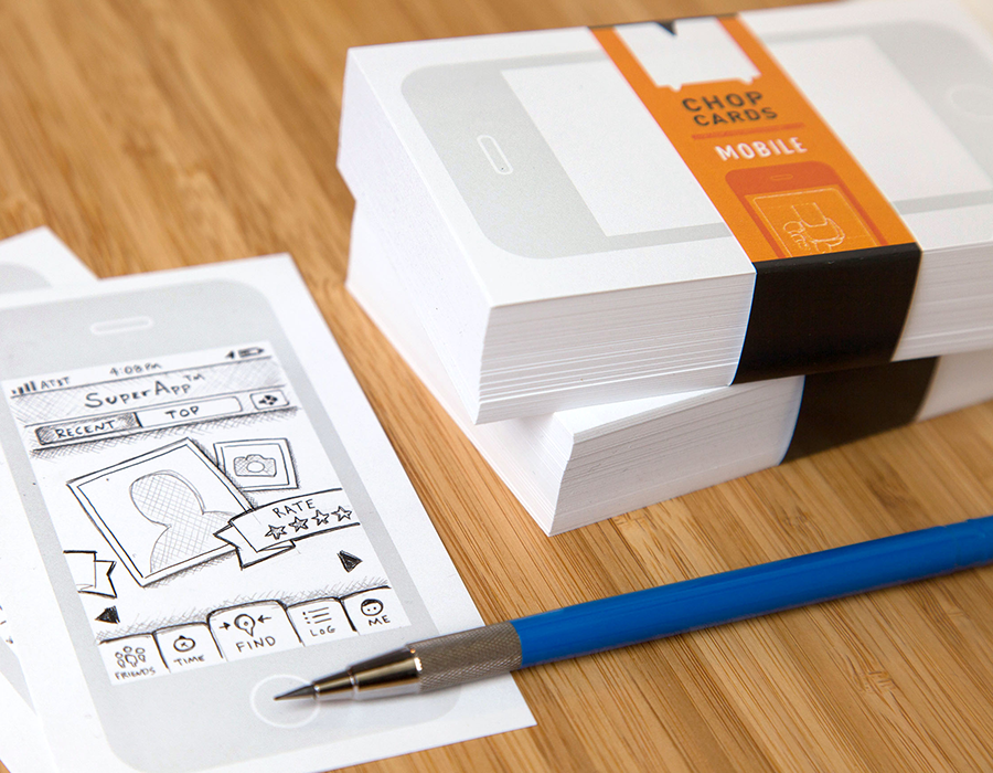
- Branding, Design, UX, Consulting, Animation
- Epic functional spec with inline drawings
Identity
Qelavi
Oilily Rebranding

Upscale Clothing Store Identity
- Branding, Design
Site
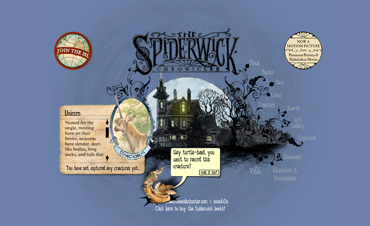
Spiderwick
Simon & Schuster
Website for the Spiderwick Book Series
- Design, UX, Development, Animation
Site
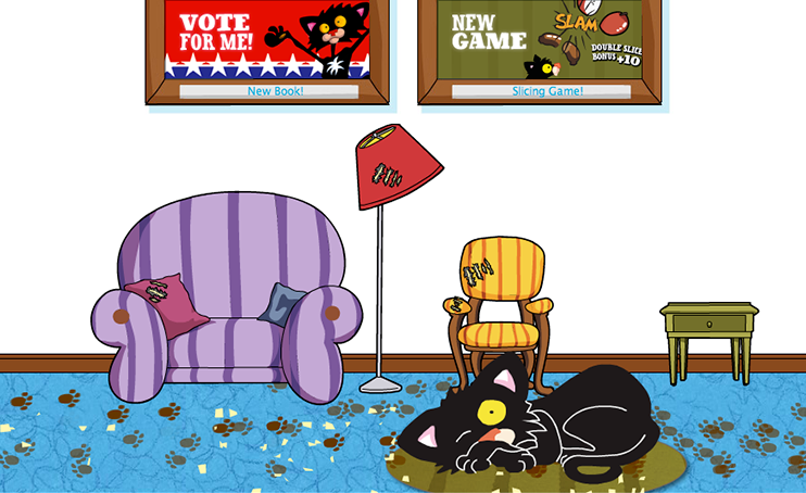
Bad Kitty
Macmillan
Website & Games for the Bad Kitty Series
- Design, UX, Development, Animation, Games
Site
uRule
Scholastic, Inc.
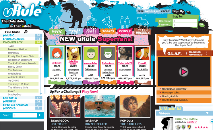
Scholastic Web Portal for kids
- Design, UX, Animation
Mixed
No!
They Might be Giants
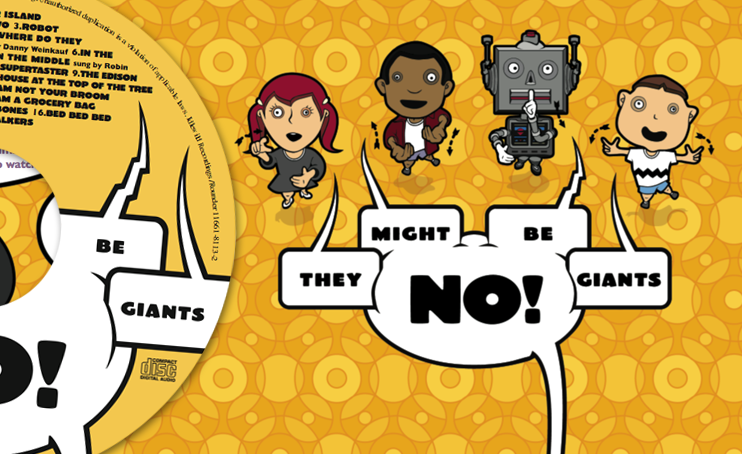
Kid's Album for They Might Be Giants
- Design, UX, Animation, Concept
Design
FasttMath
Scholastic, Inc.
Next Generation Math fluency software
- UX, Design, Animation, Development
- FasttMeter prototype, Theme Browser
Design
MATH 180
Scholastic, Inc.
Revolutionary New Math Intervention Program
- UX, Design, Animation, Development, Consulting
- Student Prototype, TE Prorotype, Everything
